still got "Feedback" though...
i'm thinking about making the buttons bigger, possibly adding a little of the metal stuff i used in the banner so it all fits together nicely.
New Jedi Order Mod
Moderator: Moderators
-
Trans
Okay, well I have a ton of time this weekend to work on anything I want because 50 pounds just got lifted off my back today when I finished a project, so if anything else needs to be done (other than nav bar) or if anyone has something they want me to add to the site or anything I'm open to suggestions. 
btw I can't think of anything for my location so I'm about halfway through Balance Point.
:chew: Trans :chew:
btw I can't think of anything for my location so I'm about halfway through Balance Point.
:chew: Trans :chew:
-
dreadlordnyax
how bout finishing up that coralskipper
if you're looking for stuff to add to the site, i think it'd be nice if we could have border on the sides kinda like this site see how its got all the content in the middle, then that vertical border, then one solid color?
i dont know how much learning/coding that would require, it'd look nice, but its not necessary if its too much work. (i would design the border, i'd just need you to figure out how to implement it)
okey dokey, here's the newest button version. its a little bigger, tell me if its too big...and what you think of the metal/new font (put it on a black background, like the site, it really matches the banner)

i was thinking i'd use a different part of the image for each button...probably including parts of the firebreathers image too...
if you're looking for stuff to add to the site, i think it'd be nice if we could have border on the sides kinda like this site see how its got all the content in the middle, then that vertical border, then one solid color?
i dont know how much learning/coding that would require, it'd look nice, but its not necessary if its too much work. (i would design the border, i'd just need you to figure out how to implement it)
okey dokey, here's the newest button version. its a little bigger, tell me if its too big...and what you think of the metal/new font (put it on a black background, like the site, it really matches the banner)
i was thinking i'd use a different part of the image for each button...probably including parts of the firebreathers image too...
-
Trans
My Milkshape expires in 1 day(s)  so I will have to buy it to finsih that (hopefully I can somehow talk my parents into getting it for me)
That border is a definite...possibilty I'll look into it
I really like the button but it won't work for me, I got the URL from properties and it doesn't work on the site or in the address bar but it is fine in your post.
EDIT: My progress on learning the border: http://www.freewebs.com/njoswbf2/banner.htm (so we will probably be able to do it) EDIT3: This doesn't work anymore
EDIT2: My search continues, it seems theirs is in a script or something...
That border is a definite...possibilty I'll look into it
I really like the button but it won't work for me, I got the URL from properties and it doesn't work on the site or in the address bar but it is fine in your post.
EDIT: My progress on learning the border: http://www.freewebs.com/njoswbf2/banner.htm (so we will probably be able to do it)
EDIT2: My search continues, it seems theirs is in a script or something...
-
dreadlordnyax
thats weird about the button...can you save it and upload it to the site yourself?
& yeah i'm not really seeing any borders in that link. i know alpha said he was leaving or something but might you still be able to ask him about it? (or didn't he say dvondrake could help too?)
you want me to go ahead and make the rest of the buttons like that one? and hopefully at some point i'll get around to updating the banner further, with like a matching metallic semi-outline border thing...
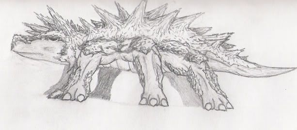
oh, and i just realized i forgot to scan those sketches i did a while ago that you recently brought up...
& yeah i'm not really seeing any borders in that link. i know alpha said he was leaving or something but might you still be able to ask him about it? (or didn't he say dvondrake could help too?)
you want me to go ahead and make the rest of the buttons like that one? and hopefully at some point i'll get around to updating the banner further, with like a matching metallic semi-outline border thing...
oh, and i just realized i forgot to scan those sketches i did a while ago that you recently brought up...
-
Trans
-
dreadlordnyax
http://i18.photobucket.com/albums/b131/ ... coufee.jpg
http://i18.photobucket.com/albums/b131/ ... akamat.jpg
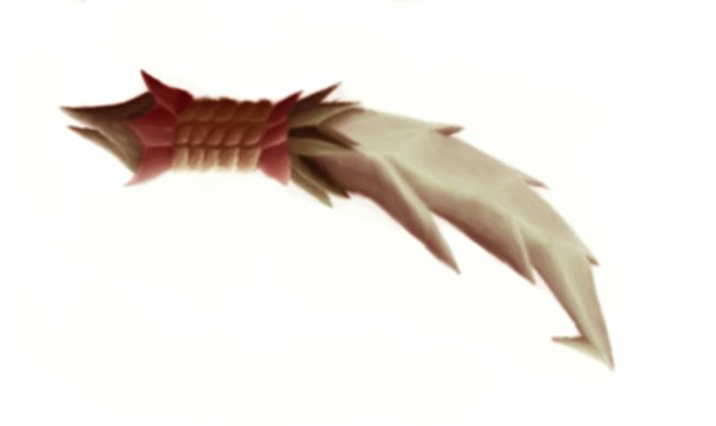
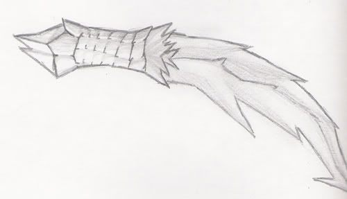
finally got those drawings scanned. sorry the tops got cut off a little. and the rakamats armor should be dark (it looks light because of the way i drew it, and i don't have the motivation to go back and fix it. maybe in painter...).
edit: finished the buttons too. they're kinda big, i think you'll need to set it up so either we have vertical navigation, or 2 rows


http://i18.photobucket.com/albums/b131/ ... akamat.jpg
finally got those drawings scanned
edit: finished the buttons too. they're kinda big, i think you'll need to set it up so either we have vertical navigation, or 2 rows
-
Trans
-
dreadlordnyax
-
JabbaLovesLava
- Sith

- Posts: 1396
- Joined: Tue Jun 07, 2005 11:50 am
-
Trans
I'll put it up, where do you guys think it would be most appropriate:
1. On the "factions" page where weapons are talked about or
2. On the "downloads/media page", but the button only says downloads or
3. On the "models" page where it would serve as CA for its model????
I'll put it up when somone replys, and I am also still working on the nav bar (can't get it to look just right)
-
JabbaLovesLava
- Sith
- Posts: 1396
- Joined: Tue Jun 07, 2005 11:50 am
-
Trans
Well I guess that depends on how much CA is going to be made, and I can't draw on the computer and I don't have a scanner so it is up to Dread, who is our only person making art. If you think there wil be more CA then make a button and I'll add the page, if you don't think you will be making a lot more than choose 1-3.
EDIT: Dread can you look through your stash of pics and get me some of some skips, preferably where you can see the cannons.
EDIT2: Look at the background info for a WIP of the nav bar
EDIT: Dread can you look through your stash of pics and get me some of some skips, preferably where you can see the cannons.
EDIT2: Look at the background info for a WIP of the nav bar
-
dreadlordnyax
about the nav bar:
i dont think you really need the text "main menu", if you really want it tell me and i'll make a sorta different looking button for it.
also, please get rid of the ugly blue border
and, finally, the buttons were designed to be put on a black background, so they'd blend in. you might, uh, wanna change that. it'd be nice if you could change the gray border around the whole navigation to dark red.
also, my computers being really slow, but the factions button isn't showing up at all, and i get an empty box for the gametoast link (good idea, btw). the buttons also seem unevenly spaced (gaps between some, whereas others are touching).
you've probably already seen most, if not all of the skip pictures i have, but, here ya go:
http://www.starwars.jp/machine/image/coralskipper.jpg
http://legacy.gamemod.net/Images/render ... kipper.jpg
http://www.geocities.com/kwenndb/Coralskipper_bg.jpg
http://www.geocities.com/kwenndb/Coralskipper_img.jpg
there's also a pic of a skip on this japanese cover (bottom left)
http://www.theforce.net/image_popup/ima ... force1.jpg
and of course, the 'spiky' skips in that pic i posted a while back
and sure, adding a ca page, or maybe just an "art" page, would be good. some wallpapers or something...i'll make a button for that later
-
Trans
I know about all those problems and I am trying to fix them and thanks for the pics (trying to work on model)
The Gametoast one is my fault and I'm trying to fix that too. Also if you didn't notice if you click on the pic (coufee) then it gives you the full size.
woops just noticed I didn't put the faction button in
EDIT: I think I fixed everything but the GT button and the ugly border I can't figure it out so I'll go ask someone...
EDIT2: YAY I don't need help I figured it out
The Gametoast one is my fault and I'm trying to fix that too. Also if you didn't notice if you click on the pic (coufee) then it gives you the full size.
woops just noticed I didn't put the faction button in
EDIT: I think I fixed everything but the GT button and the ugly border
EDIT2: YAY I don't need help I figured it out
-
dreadlordnyax
-
dreadlordnyax
Artand Featured (pictures wouldn't so much fit, besides, now you can put other stuff as "featured" too)
and i noticed you got the border fixed much better. although i'm still kinda iffy on whether we should keep the gray border around the whole navigation...?
also, uh, the title ">>>Background Information" is above the nav bar, it looks sorta odd there
and i noticed you got the border fixed
also, uh, the title ">>>Background Information" is above the nav bar, it looks sorta odd there
-
Trans