Bothawui - v1 Released!
Moderator: Moderators
-
Nova Hawk
- Banned
- Posts: 4089
- Joined: Mon Sep 22, 2008 3:17 pm
- Projects :: No Mod project currently.
Re: Bothawui
Lookin' nice. Can't wait to see the custom sides.
-
sampip

- General

- Posts: 792
- Joined: Mon Mar 16, 2009 12:08 pm
- Projects :: Something big. And exciting.
- xbox live or psn: masowner66
- Location: Zebra
Re: Bothawui
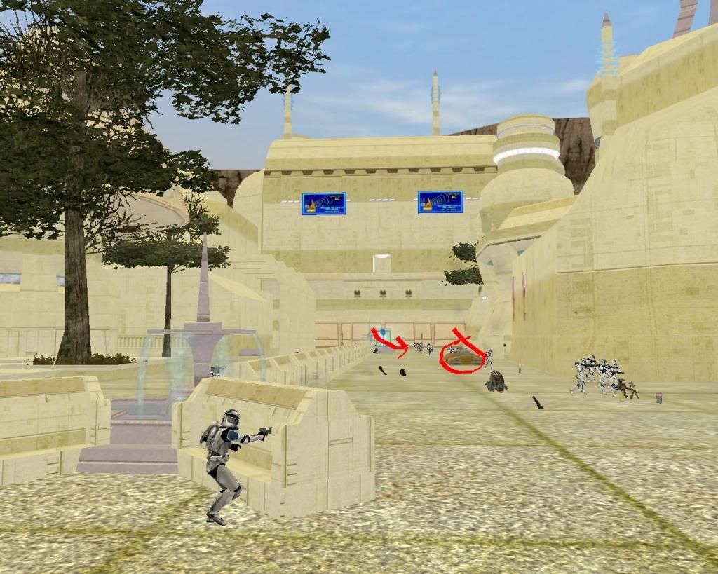
Small update, added some details 'n that to the map. They all are helping to look much more like a city:
Comments?
I'll put these on the first post aswell.
Hidden/Spoiler:
I'll put these on the first post aswell.
-
Nihillo

- Master Bounty Hunter

- Posts: 1548
- Joined: Sun Jan 04, 2009 9:53 pm
- Location: Brazil
Re: Bothawui - first post updated
Love the square, overall it's a nice improvement! 
I don't like the posters they kind of stand up, they don't match the colors of the walls and attract too much attention... but I guess that's the goal of advertisement. Still, in my opinion, the map would be better without them, or at least if there were less of them and they were inside buildings and such.
Hey, perhaps you could use some of those crashed speeder props (they are props, right?) as a means to provide cover to the player!
I don't like the posters they kind of stand up, they don't match the colors of the walls and attract too much attention... but I guess that's the goal of advertisement.
Hey, perhaps you could use some of those crashed speeder props (they are props, right?) as a means to provide cover to the player!
-
CodaRez

- Field Commander

- Posts: 940
- Joined: Mon May 25, 2009 6:49 am
- Projects :: I would like one.....
- Location: Ride around the world! And I won't give you anything :P
Re: Bothawui - first post updated
Well, how bout imperial propaganda posters.
I made em "sorta, the pics were from web" and they are small, and in no way stand out. Dunno if they match the colour though. You be the judge. Link is here:
http://www.gametoast.com/forums/viewtop ... 64&t=21273
I made em "sorta, the pics were from web" and they are small, and in no way stand out. Dunno if they match the colour though. You be the judge. Link is here:
http://www.gametoast.com/forums/viewtop ... 64&t=21273
-
Teancum

- Jedi Admin

- Posts: 11080
- Joined: Wed Sep 07, 2005 11:42 pm
- Projects :: No Mod project currently.
- xbox live or psn: No gamertag set
- Location: Indiana
Re: Bothawui
Retexture the benches. They should contrast the buildings, not match them. Other than that it looks good thus farsampip wrote:Small update, added some details 'n that to the map. They all are helping to look much more like a city:
Comments?Hidden/Spoiler:
I'll put these on the first post aswell.
-
DarthD.U.C.K.
- Master of the Force

- Posts: 6027
- Joined: Wed Sep 27, 2006 11:05 am
- Location: Duckburg, Germany
Re: Bothawui - first post updated
the city looks good, but id try to reskin the buildings etc to give them a more original(/unique) and not just a recoloredbespinbuilding-look
-
sampip
- General
- Posts: 792
- Joined: Mon Mar 16, 2009 12:08 pm
- Projects :: Something big. And exciting.
- xbox live or psn: masowner66
- Location: Zebra
Re: Bothawui - first post updated
I would like to but I'm not sure of a good texture to use. Any Ideas?DarthD.U.C.K. wrote:the city looks good, but id try to reskin the buildings etc to give them a more original(/unique) and not just a recoloredbespinbuilding-look
@CodaRez: Might use them for the GCW, they look cool
I will, thanksTeancum wrote: Retexture the benches. They should contrast the buildings, not match them. Other than that it looks good thus far
Lol I actually quite liked the posters but I sorta see what you mean. One problem I'm having with them, I can't get them to stick exactly onto the wall, they are either floating slightly away from it, or inside it. Is there anyway to have precision where you put them with the move tool?Nihillo wrote:Love the square, overall it's a nice improvement!
I don't like the posters they kind of stand up, they don't match the colors of the walls and attract too much attention... but I guess that's the goal of advertisement.
Hey, perhaps you could use some of those crashed speeder props (they are props, right?) as a means to provide cover to the player!
Which speeder props?
EDIT:
Umm, well I've had a go to see what the buildings look like with a slightly different texture. To remove the Bespinlooklike effect I think I need something slightly more profound?
Hidden/Spoiler:
Hidden/Spoiler:
Any comments? I personally think it's too plain.
-
Teancum
- Jedi Admin
- Posts: 11080
- Joined: Wed Sep 07, 2005 11:42 pm
- Projects :: No Mod project currently.
- xbox live or psn: No gamertag set
- Location: Indiana
Re: Bothawui - first post updated
A couple'a other suggestions.
*Sink the Eiffel Tower into the building a little. Right now it's really obvious it's the Eiffel Tower.
*Add some more grey to some of the structures, like your reference pic. Right now everything has that yellow-green tint. If that's lighting, adjust your lighting and just retexture your buildings, as it will look much more natural.
*Overall the map has a very greenish yellow look, which makes the grass look dead, etc. I'd revisit that. You might also use some light-greyscale colors for streets.
*Don't be afraid to use rolling hills in the background along with the canyon walls to give the horizon of the city less sharpness.
*Definitely use the links AQT pointed to and use some of Rends/Vyse's excellent buildings. Stuff from Coruscant Streets will fit nicely here.
*Leaving the main area of the battle flat for the most part is fine, but be sure to add higher areas for human players to get to, like in Naboo Theed.
Coming along nicely. Looking forward to giving it a spin
*EDIT*
The new textures look much better, but have lost some of the detail.
*Sink the Eiffel Tower into the building a little. Right now it's really obvious it's the Eiffel Tower.
*Add some more grey to some of the structures, like your reference pic. Right now everything has that yellow-green tint. If that's lighting, adjust your lighting and just retexture your buildings, as it will look much more natural.
*Overall the map has a very greenish yellow look, which makes the grass look dead, etc. I'd revisit that. You might also use some light-greyscale colors for streets.
*Don't be afraid to use rolling hills in the background along with the canyon walls to give the horizon of the city less sharpness.
*Definitely use the links AQT pointed to and use some of Rends/Vyse's excellent buildings. Stuff from Coruscant Streets will fit nicely here.
*Leaving the main area of the battle flat for the most part is fine, but be sure to add higher areas for human players to get to, like in Naboo Theed.
Hidden/Spoiler:
*EDIT*
The new textures look much better, but have lost some of the detail.
-
Rekubot
- Jedi

- Posts: 1080
- Joined: Wed Apr 05, 2006 12:34 pm
- Projects :: No Mod project currently.
- xbox live or psn: Rekubot
- Location: UK
Re: Bothawui - first post updated
Came in to say this looks very, very impressive. Good job!
-
Nihillo
- Master Bounty Hunter
- Posts: 1548
- Joined: Sun Jan 04, 2009 9:53 pm
- Location: Brazil
Re: Bothawui - first post updated
sampip wrote:Which speeder props?
Hidden/Spoiler:
-
sampip
- General
- Posts: 792
- Joined: Mon Mar 16, 2009 12:08 pm
- Projects :: Something big. And exciting.
- xbox live or psn: masowner66
- Location: Zebra
Re: Bothawui - first post updated
They are playable vehicles based on the GIAN speeder .
That is damaged because some uncontrolled AI has driven it right into a wall and then into his teammates -- (haven't done any planning yet)
I don't know if anyones done a damaged model of it but there are seperate chunk models which I could use to make it look scattered, but like someone said earlier, Bothawui is quite a clean, organized city and the Bothans wouldn't just leave broken speeder lying around the place, I guess. Dunno though.
@Tean - Thanks for you suggestions, massive help
thanks for all comments!
-
Xavious
- Sith Master

- Posts: 2783
- Joined: Mon Jun 12, 2006 3:46 pm
Re: Bothawui
Get rid of those advertisements on the buildings. They look very out of place.
-
lesovikk1
- Captain

- Posts: 484
- Joined: Thu Nov 20, 2008 1:29 pm
- Projects :: No Mod project currently.
- xbox live or psn: No gamertag set
- Location: In my own dream world :D
- Contact:
Re: Bothawui
I have to disagree. They look in place as its a city. To me that is...Xavious wrote:Get rid of those advertisements on the buildings. They look very out of place.
-
Ping

- Sith

- Posts: 1398
- Joined: Thu Sep 18, 2008 4:19 pm
- Location: College
Re: Bothawui
Having ads is okay, but the color is in sharp contrast to the building's color.lesovikk1 wrote:I have to disagree. They look in place as its a city. To me that is...Xavious wrote:Get rid of those advertisements on the buildings. They look very out of place.
-
Teancum
- Jedi Admin
- Posts: 11080
- Joined: Wed Sep 07, 2005 11:42 pm
- Projects :: No Mod project currently.
- xbox live or psn: No gamertag set
- Location: Indiana
Re: Bothawui
Yeah, I was going to mention that -- the contrast is what makes them stick out.Ping wrote:Having ads is okay, but the color is in sharp contrast to the building's color.lesovikk1 wrote:I have to disagree. They look in place as its a city. To me that is...Xavious wrote:Get rid of those advertisements on the buildings. They look very out of place.
-
Xavious
- Sith Master
- Posts: 2783
- Joined: Mon Jun 12, 2006 3:46 pm
Re: Bothawui
Not just the color, but based on the reference shown in the first post, the city doesn't seem like one that would have holographic/ video/ whatever advertisements hanging from its buildings.Teancum wrote:Yeah, I was going to mention that -- the contrast is what makes them stick out.Ping wrote:Having ads is okay, but the color is in sharp contrast to the building's color.lesovikk1 wrote:I have to disagree. They look in place as its a city. To me that is...Xavious wrote:Get rid of those advertisements on the buildings. They look very out of place.
-
myers73
- Lieutenant General

- Posts: 690
- Joined: Fri Apr 03, 2009 11:04 pm
- Projects :: No Mod project currently.
- xbox live or psn: No gamertag set
- Location: Atlanta, GA xfire=myers73 IngameName=mYers
Re: Bothawui
the contrast and their placement. if you drive through any city you rarely see adds randomly placed on the side of buildings. put them in the top corners, and group 2 or 3 together.
-
sampip
- General
- Posts: 792
- Joined: Mon Mar 16, 2009 12:08 pm
- Projects :: Something big. And exciting.
- xbox live or psn: masowner66
- Location: Zebra
Re: Bothawui
I was thinking they don't really suit a Bothawui map but I wasn't sure whether to add them or not.
I think, judging by the comments, I will get rid of them.
I'm also importing Rends buildings one by one. These ones with be the grey buildings, and there will be one every now and then. Some will also use the original cream texture. Only problem is, I'm not sure if they have a low-rez (at least they don't for me), I might have forgotten to copy the files across, but at the moment they disappear if you go too far away. Only a small problem though.
Update
Need opinions on grey, not too sure of it myself:
EDIT
Please say if they look better or worse. I really need to know if I should stick with them or go back to step 1. I've been testing over the past few days so nothing you see here atm is for definite. Just so you know
I think, judging by the comments, I will get rid of them.
I'm also importing Rends buildings one by one. These ones with be the grey buildings, and there will be one every now and then. Some will also use the original cream texture. Only problem is, I'm not sure if they have a low-rez (at least they don't for me), I might have forgotten to copy the files across, but at the moment they disappear if you go too far away. Only a small problem though.
Update
Need opinions on grey, not too sure of it myself:
Hidden/Spoiler:
Hidden/Spoiler:
Hidden/Spoiler:
Please say if they look better or worse. I really need to know if I should stick with them or go back to step 1. I've been testing over the past few days so nothing you see here atm is for definite. Just so you know
Last edited by sampip on Wed Dec 16, 2009 2:14 pm, edited 1 time in total.
-
Blade117
- Command Sergeant Major

- Posts: 293
- Joined: Thu Nov 26, 2009 9:10 pm
- Projects :: No Mod project currently.
- Location: location, location
Re: Bothawui
Nice touch, except in pic 1 on the cylindrical building, but that might just be the angle.
EDIT: Stay with them.
EDIT: Stay with them.
Last edited by Blade117 on Wed Dec 16, 2009 5:40 pm, edited 1 time in total.
-
Nihillo
- Master Bounty Hunter
- Posts: 1548
- Joined: Sun Jan 04, 2009 9:53 pm
- Location: Brazil
Re: Bothawui
I think the gray is fine.