Page 20 of 34
Re: Graphic Art - Everything Else (II)
Posted: Wed Mar 09, 2011 4:23 pm
by commander501stappo
Very nice GT logo

Re: Graphic Art - Everything Else (II)
Posted: Sun Mar 13, 2011 9:05 pm
by Null_1138
Re: Graphic Art - Everything Else (II)
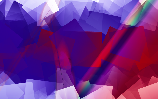
Posted: Sun Mar 13, 2011 9:15 pm
by GangsterJawa
I love fractals. What did you use to make that?
Re: Graphic Art - Everything Else (II)
Posted: Mon Mar 14, 2011 12:13 pm
by Anakin
that's quiet great. could be my

i think you used paint.net
1) rainbow color effect
2) rotating
3) blur effect
4) lens blur or slots effect
but how do you made the light effect??
Re: Graphic Art - Everything Else (II)
Posted: Mon Mar 14, 2011 2:55 pm
by Null_1138
GIMP:
- Black background
- New layer1
- Render > Nature > Flame
- Picked the one I wanted
- Saved as PSD.
PS CS4:
- New layer2
- Select a circle in the center
- Feather
- Paint bucket
- Set layer2 to Overlay
- Repeat for other colors.
- Saved, then saved as PNG.
Re: Graphic Art - Everything Else (II)
Posted: Mon Mar 14, 2011 3:07 pm
by commander501stappo
Hehe, you failed Anakin
Just kidding

Nice picture, I really like it

Re: Graphic Art - Everything Else (II)
Posted: Mon Mar 14, 2011 10:36 pm
by Labj
Very nice pic, but i think that making the rainbow colors is easy on GIMP also, but still its an awesome pic
Re: Graphic Art - Everything Else (II)
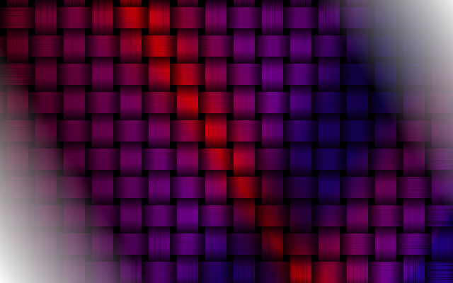
Posted: Tue Mar 15, 2011 1:43 pm
by Anakin
Null_1138 wrote:GIMP:
- Black background
- New layer1
- Render > Nature > Flame
- Picked the one I wanted
- Saved as PSD.
PS CS4:
- New layer2
- Select a circle in the center
- Feather
- Paint bucket
- Set layer2 to Overlay
- Repeat for other colors.
- Saved, then saved as PNG.

what is PS CS4??
the first part is the ligth effect?
==EDIT==
new pic:
Re: Graphic Art - Everything Else (II)
Posted: Tue Mar 15, 2011 3:01 pm
by commander501stappo
Cool picture Anakin

Anakin wrote:what is PS CS4??
That's PhotoShop CS4
Re: Graphic Art - Everything Else (II)
Posted: Mon Apr 04, 2011 9:12 pm
by Labj
No more models to work on today... too bored.
Re: Graphic Art - Everything Else (II)
Posted: Tue Apr 05, 2011 4:45 am
by Darth_Spiderpig
*Badonk*
Looks great Labj.

Re: Graphic Art - Everything Else (II)
Posted: Tue Apr 05, 2011 11:00 am
by Anakin

looks funny
Re: Graphic Art - Everything Else (II)
Posted: Wed Apr 06, 2011 7:49 am
by mswf
I'm trying to make a site for my basketball team. I started out with this layout:
And I've now got this:
I think it changed for the better, does anyone see any errors that I should correct?
Re: Graphic Art - Everything Else (II)
Posted: Wed Apr 06, 2011 8:49 am
by Anakin
great 2nd one is better
Re: Graphic Art - Everything Else (II)
Posted: Wed Apr 06, 2011 9:00 am
by Dohnutt
mswf wrote:I'm trying to make a site for my basketball team. I started out with this layout:
And I've now got this:
I think it changed for the better, does anyone see any errors that I should correct?
Looks alright, just seems a bit busy. I personally liked the first one better.
Re: Graphic Art - Everything Else (II)
Posted: Wed Apr 06, 2011 11:30 am
by Jdg50
Re: Graphic Art - Everything Else (II)
Posted: Wed Apr 06, 2011 12:16 pm
by mswf
Dohnutt wrote:Looks alright, just seems a bit busy. I personally liked the first one better.
I see what you mean. To be honest, I was working from a worn-down monitor on school. I'm now at home and I've now lowered the brightness of the background tripes a bit, I think it's a bit more easy on the eye now.
The site is also meant to attract people to a new club, so that's why I opted for a more colorful and vivid look.
Re: Graphic Art - Everything Else (II)
Posted: Wed Apr 06, 2011 11:35 pm
by jedikiller32
Modern web design usually follows the principle of "less-is-more". Colorful and vivid is all very well and good in print media and in advertisements, but it rarely is pleasing to the eye. When someone visits your website, you want them to notice not the design of your website but to actually look at your content and spend more time on that than your design.
Your design here isn't too bad, but it serves more to draw the eye away from your content. I can't read the language, but even if I could I would be hard pressed to read it due to the stripes on the background. You have solved this problem in one section of the webpage, but haven't in another: your background used in the iframes is much, much better for general readability.
A couple more pointers: in your sidebars where the text is ("home", "news", "sponsor"), there needs to be padding on the sides to make them more over the background images. Actually, I would just remove the background images, since they clash with the background. Also, the logo that is displayed on first loading is too big on my monitor. I suggest scaling it down significantly and using it as a header on the "Over ons" page (google tells me that means "about us") and using that as the front page.
Your iframe setup also breaks the sponsor link on the side - change the "target" to "_top".
Other than that, I didn't really see anything else I would fix - maybe some coloration changes on your links, but you only use it in one location so I guess it's not really necessary.
If you need any help or anything, feel free to PM me and I'll be glad to help you out
I'm fairly knowledgeable about this stuff.
Re: Graphic Art - Everything Else (II)
Posted: Sun Apr 24, 2011 4:38 pm
by Eaol

This isn't so much "art" as it is just a testing of GIMP's filters' ability to make a simple diagram appear more interesting. I then gave the .jpg a drop shadow, and converted it to .tga. That was all well and good, but then I found that ImageShack doesn't support .tga. So I had to convert it from .tga to .gif and the quality went down a bit, as you can see here. All in all, semi waste of time, but I had to do something with it, didn't want it to go to waste.
So what you see here is a diagram of the Sun, based on observational/experimental and not theoretical evidence. This model holds its own against the evidence that contradicts the fusion model
. Unfortunately, for those of you who care, this graphic doesn't explain how the Sun works. It only gives a visual representation of what it probably looks like in cross section.
Original graphic credited to I think Wallace Thornhill. Ask him about where it came from, not me. It's from one of his articles. (It may instead be from Dr. Anthony Perratt, but enough with that.)
P.S. - My drop shadow isn't visible on the theme I am using (Starguru).
EDIT: I think the glow effect in there is from PAINT.net. I know, I cheated.
EDIT2: Ah. The image is from an e-book called
The Universe Electric - The Sun.
Re: Graphic Art - Everything Else (II)
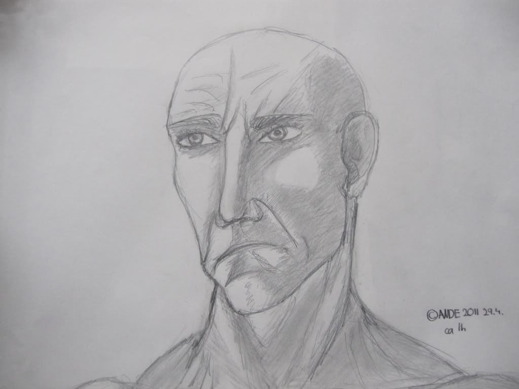
Posted: Sat Apr 30, 2011 1:27 pm
by ANDEWEGET
Sad BRINK fan art guy is sad. Anatomy isnt spot-on but its solid, eyes could be better, I didnt want to spend too much time on it... The camera distorted it some, still way better than my scanner though.