Re: Glamour Skins parte 6
Posted: Thu Jun 11, 2009 7:20 pm
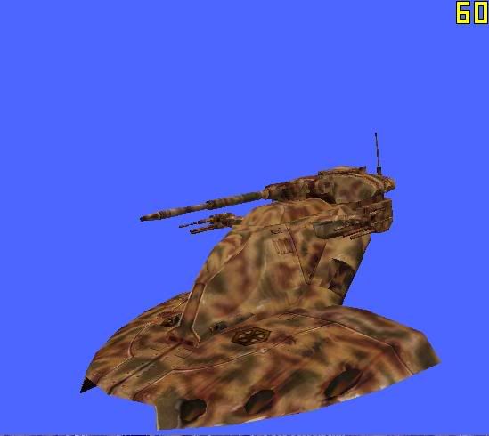
A revision of my first reskin ever: 501st Clone Lieutenant
Hidden/Spoiler:
Thats..... awethimsauce, as fluff might sayAQT wrote:A revision of my first reskin ever: 501st Clone LieutenantHidden/Spoiler:
yea thats exactly what i thought! thats an awesome skin man!GangsterJawa wrote:Does that steal a texture from a German King Tiger tank of the WWII era? It looks strikingly similar. Great job!
okay that's fine. i think it would go really nice with selva prime, as it compliments that deka skin i posted a few pages agoRevanSithLord wrote:Sure. I don't mind. I'll upload it sometime. Right now I'm in the mood for a game, though. lmao
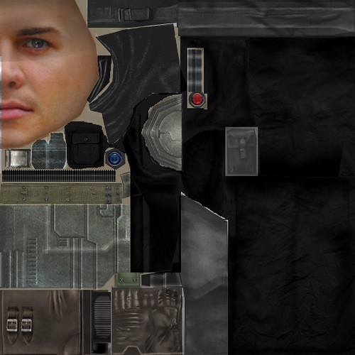
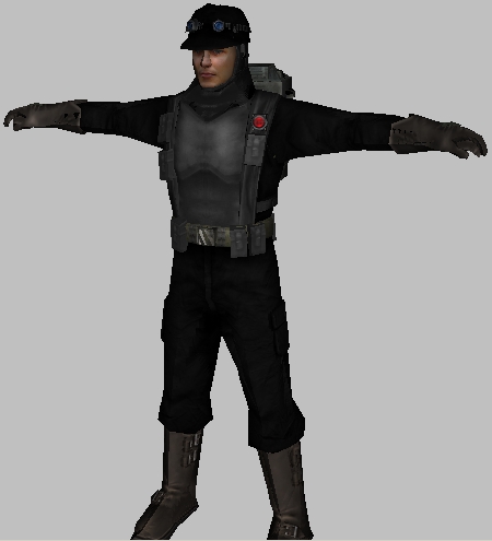
That's not bad, good job.Nylad wrote:I decided the standard tan engineer gets a little old, so this is what I did about it.Here's what it looks like on the model.Hidden/Spoiler:Hidden/Spoiler:
Arg, you need to cut down on the excessive sharpening. Your color templates and palettes are well-done, but all your reskins are way, way too sharp (to the point where you can see pixelation). That should be corrected.B.I.G_Cookie wrote:And the skin
Hidden/Spoiler:
The grey is a little bit to dark and the blue is to bright..
i love youB.I.G_Cookie wrote: And the skin
Hidden/Spoiler:
The grey is a little bit to dark and the blue is to bright..
definitely agree. a certain amount of praise i agree with but really i wouldn't give excessive praise until the sharpness is fixed. its good otherwise though.Maveritchell wrote:Arg, you need to cut down on the excessive sharpening. Your color templates and palettes are well-done, but all your reskins are way, way too sharp (to the point where you can see pixelation). That should be corrected.B.I.G_Cookie wrote:And the skin
Hidden/Spoiler:
The grey is a little bit to dark and the blue is to bright..
obiboba3po wrote:definitely agree. a certain amount of praise i agree with but really i wouldn't give excessive praise until the sharpness is fixed. its good otherwise though.Maveritchell wrote:Arg, you need to cut down on the excessive sharpening. Your color templates and palettes are well-done, but all your reskins are way, way too sharp (to the point where you can see pixelation). That should be corrected.B.I.G_Cookie wrote:And the skin
Hidden/Spoiler:
The grey is a little bit to dark and the blue is to bright..
Much better, but now your CIS logo is blurry. I don't know what you're using for a source there, but it might be better to either:B.I.G_Cookie wrote:obiboba3po wrote:definitely agree. a certain amount of praise i agree with but really i wouldn't give excessive praise until the sharpness is fixed. its good otherwise though.Maveritchell wrote:Arg, you need to cut down on the excessive sharpening. Your color templates and palettes are well-done, but all your reskins are way, way too sharp (to the point where you can see pixelation). That should be corrected.B.I.G_Cookie wrote:And the skin
Hidden/Spoiler:
The grey is a little bit to dark and the blue is to bright..
Ok after constructive critism
Improved skin.Hidden/Spoiler:
Maveritchell wrote:Much better, but now your CIS logo is blurry. I don't know what you're using for a source there, but it might be better to either:
a) draw it yourself, or
b) use one of the stock icons